


OnePro (Dark) - Icon Pack
Eatos
OnePro (Dark) is the kind of personalization app that makes an immediate impression without asking you to rebuild your entire phone. It is a paid dark icon pack from Eatos, designed around the One 8 visual style, and its appeal is easy to understand: replace a mixed collection of colorful app symbols with a calmer, darker home screen that feels more deliberate.
I found the first change especially noticeable on a busy Android setup. The icons look less visually loud, so the wallpaper, widgets, and app names have more room to breathe. That sounds like a small adjustment, but a phone is something I look at repeatedly throughout the day. When the home screen stops feeling like a pile of unrelated logos, the whole device can seem more coherent.
The important question, though, is not whether the pack looks good for an afternoon. Most icon packs can win that test. The better question is whether I still want it installed after the novelty fades, whether it remains practical as my app collection changes, and whether the darker treatment creates any daily friction. In my experience, this pack has a strong visual identity, but its lasting value depends heavily on how much you care about a consistently styled launcher.
From the first-week makeover to everyday use
Why the initial impression is so strong
The One 8 influence gives the icons a recognizable personality rather than a generic dark filter. The darker palette makes the home screen feel quieter, while the shared treatment reduces the contrast between apps that normally use very different colors and shapes. If your current layout includes bright social, shopping, banking, and messaging icons side by side, the difference is immediately visible.
I would describe the look as restrained rather than dramatic. It is not trying to turn the phone into a futuristic dashboard or imitate a specific hardware brand. That makes it easier to live with. A highly stylized pack can be exciting at first and tiring later, especially when the icons compete with the wallpaper. OnePro (Dark) is more comfortable in that respect because the dark approach naturally stays in the background.
Related News

Why WhatsApp Messenger Still Makes Everyday Communication Feel Easy

Jurassic World: The Game Is the Better Dino Tycoon for Strategic Players

Threads in Real Life: Who Should Join, Lurk, or Leave

How SHEIN Turned Shopping Into an Endless Content Feed

How to Make Fortnite Feel Smarter on Mobile

Should You Switch to Microsoft Outlook on Mobile?
The pack is listed for Everyone and works with Android versions starting at 6.0, which makes it accessible across a broad range of devices. It is also a relatively small commitment compared with changing launchers, installing a new operating system skin, or redesigning a complete home-screen setup. The main requirement is that your launcher support icon packs in the way you expect. That compatibility check matters more than the visual preview: an attractive pack is not useful if your preferred launcher cannot apply it properly.
A realistic first-week setup
My preferred way to test an icon pack is not to apply it everywhere immediately. I start with the first home-screen page and the dock, because those are the icons I see most often. With this pack, that approach works well. The darker style has enough presence to make the change obvious, but it does not force me to reorganize my entire phone before I know whether I like it.
After a few days, I would move less-used apps into the design only if they fit naturally. This is where the difference between a temporary makeover and a lasting setup becomes clear. A home screen can look excellent when every visible icon matches, but the effect weakens when a few bright symbols remain in prominent positions. Rather than treating that as a flaw immediately, I see it as a useful reminder to keep the first page focused on the apps I actually use.
Gallery
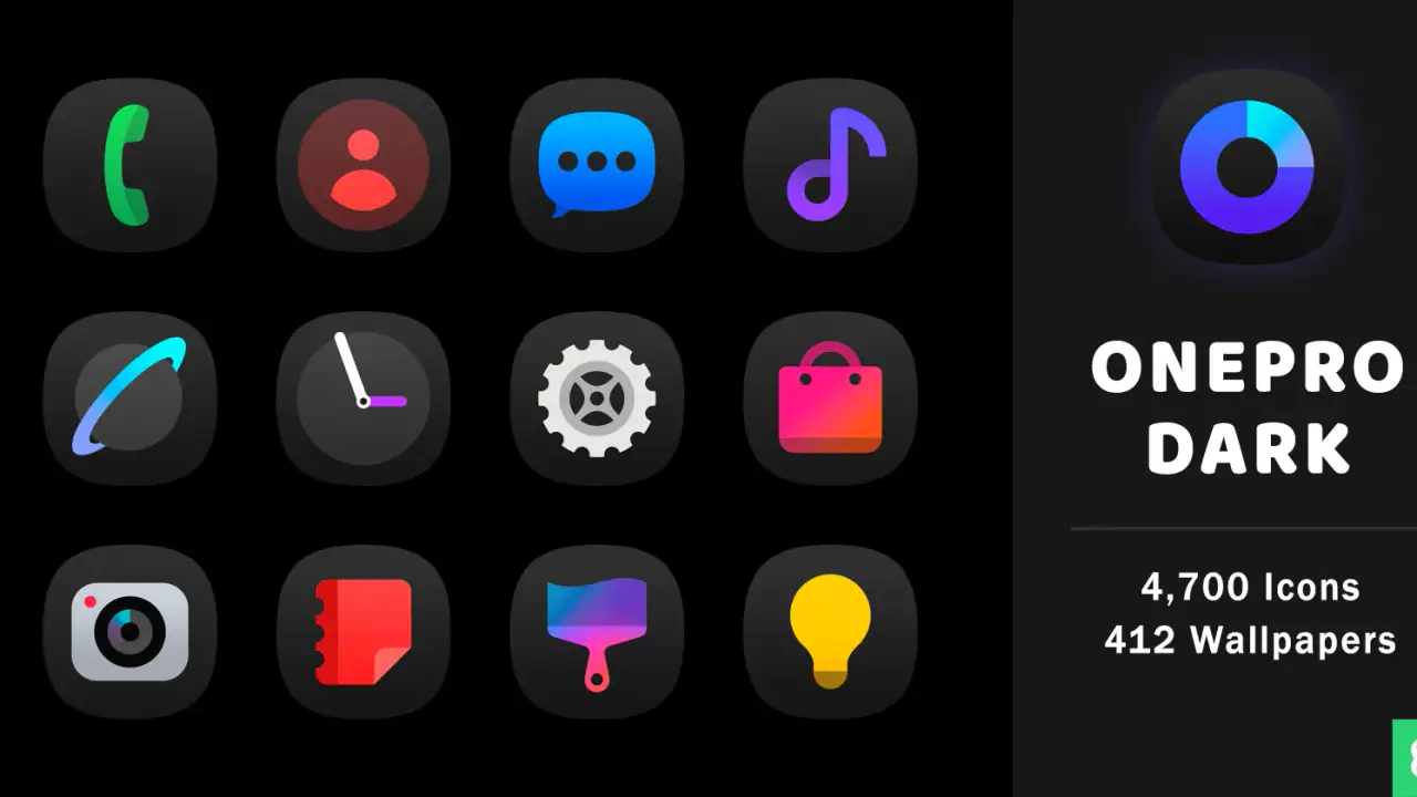
One practical tip is to judge the icons at the size you normally use, not only in a store preview or a launcher selection screen. Dark icons can look beautifully balanced when viewed together, yet some shapes may become less instantly recognizable once they are reduced on a small screen. I found that familiar placement becomes more important after switching to a unified pack. Keeping messaging, maps, camera, and payment apps in their usual locations reduces the small recognition delay caused by their new appearance.
Where the pack fits best
This is a particularly good match for people who use dark mode, subdued wallpapers, and a relatively tidy home screen. It also suits anyone who finds standard app logos too distracting. A monochrome or dark visual layer can make a phone feel less like an advertising surface and more like a personal tool.
The result is less convincing if your style depends on bright widgets, colorful wallpapers, or highly recognizable original logos. In that situation, the icons may look disconnected from the rest of the layout. The pack is not a universal improvement; it is a design choice that works best when the surrounding elements support it.
I also think it is better for users who revisit their home screen occasionally than for people who constantly rearrange it. The more frequently you add apps, change launchers, or rebuild pages, the more often you will notice the boundaries of an icon pack. A stable layout lets the visual system settle into the background, which is exactly where this dark style performs best.
What remains useful after the novelty disappears
The lasting benefit is not the excitement of seeing new icons. It is the reduction of visual noise. After the first week, I stopped looking at the pack as a new decoration and started judging whether it made everyday navigation more comfortable. For me, the answer was mostly yes when the first page stayed selective.
That distinction is important. An icon pack cannot make an overcrowded home screen organized by itself. It can unify the appearance, but it cannot decide which apps deserve a place, remove duplicate shortcuts, or fix a confusing folder structure. I got more value by combining the pack with a simple habit: keep only frequent actions visible and leave everything else in the app drawer or a clearly named folder.
OnePro (Dark) is therefore strongest as part of a maintenance routine, not as a one-time visual trick. If you apply it and never reconsider your layout, you may eventually notice that the dark treatment is hiding a clutter problem rather than solving it. If you use it as a reason to simplify the home screen, the pack has a better chance of earning permanent space.
The month-to-month question
Over a longer period, an icon pack has to survive new downloads, changing habits, and the occasional forgotten shortcut. The recurring value here comes from consistency. Every time I return to the home screen, the same visual language is waiting for me. That steadiness can be surprisingly pleasant, especially after using a phone whose icons came from many unrelated design systems.
There is also a useful psychological effect in keeping the appearance stable. When the layout and icon treatment remain familiar, I spend less time tweaking the phone and more time using it. This pack does not need constant attention to look good, provided the launcher handles the applied icons consistently and I avoid filling the main page with every new app.
Still, the value is naturally lower for someone who enjoys frequent customization. If you regularly switch between themes, wallpapers, and launchers, OnePro (Dark) may become one option among many rather than a lasting choice. Paying for an icon pack makes more sense when you expect to use its visual system for a meaningful stretch of time.
Maintenance is simple, but not invisible
The basic maintenance burden is not about daily work. It is about occasional cleanup. New apps may not feel as integrated as the original set, and a changed launcher can require you to apply or configure the pack again. Even when the pack itself is well designed, the surrounding Android setup determines how polished the final result feels.
I recommend checking the home screen after installing a few new apps rather than waiting until it becomes visually inconsistent. If a new icon stands out, there are three sensible responses: move it away from the main page, place it inside a folder, or accept the contrast because quick recognition matters more than perfect styling. The third option is often the right one for essential apps. Aesthetic consistency should not make an important tool harder to find.
Another useful habit is to keep a mental distinction between appearance and function. If an icon is not themed, that does not mean the application is broken. Likewise, a themed icon may still be less recognizable than the original. I prefer to preserve speed for apps I open under pressure and reserve the most carefully styled areas for slower, more deliberate browsing.
Where fatigue can appear
The main source of fatigue is sameness. At first, seeing a unified dark set feels calm. Later, if many icons share similar silhouettes or tonal values, quick scanning can take a little more effort than it did with bright original logos. This is not a deal-breaker, but it is a real trade-off. The pack improves visual harmony partly by reducing visual differences.
That trade-off is easier to manage with a deliberate layout. I would not place every app on one page and expect the darker styling to preserve instant recognition. Grouping by task, keeping the dock limited to familiar actions, and using consistent positions makes the pack more practical over time.
Wallpaper choice can create another kind of fatigue. A dark icon pack may disappear into a very dark background, particularly if the wallpaper has a lot of detail. A slightly lighter or quieter background gives the icons enough separation without undoing the subdued mood. This is one of the easiest ways to improve the result without changing the pack itself.
There is also the possibility that you simply miss color. Some people use color as a navigation shortcut: blue means work, red means alerts, and green means communication. A dark visual system removes much of that accidental labeling. If color helps you find apps faster, the calmer appearance may not compensate for the lost cue.
How it compares with usual alternatives
Compared with leaving the original icons untouched, this pack offers a much more unified appearance, but at the cost of some immediate brand recognition. Compared with a fully monochrome setup, it has more character because the One 8-inspired treatment gives the icons a defined style instead of flattening everything into identical symbols.
It also occupies a middle ground between a complete launcher overhaul and a simple wallpaper change. A wallpaper can alter the mood of a phone without affecting navigation. A launcher can offer deeper control but may introduce more settings and habits to learn. OnePro (Dark) focuses on the visual layer, which is appealing if you want a noticeable change without turning personalization into a project.
For users who want maximum control over individual icons, a more flexible customization tool may be a better choice. That route can be worthwhile if you enjoy matching every shortcut, widget, and folder manually. For someone who wants a coherent dark foundation with less design work, this pack is the more sensible option.
Who should pay for it?
The price is $1.49, so the decision is less about a major financial risk and more about whether you will keep using the style. I see the purchase as worthwhile for someone who already knows they like dark iconography and wants a consistent look rather than a rotating collection of themes.
It is also a reasonable choice for a secondary phone, a work profile, or a device you want to make calmer without spending time redesigning every screen. The age rating of Everyone makes it broadly suitable from a content standpoint, while the minimum Android requirement keeps it relevant to older compatible devices as well.
I would skip it if you are satisfied with the original icons, rely heavily on color coding, or use a launcher that gives icon packs limited control. I would also hesitate if you change your phone’s appearance every few days. In that case, the pack may be attractive but unlikely to provide enough recurring value to justify keeping it as your default.
What the developer and current release suggest
Eatos is the developer behind the pack, and the current version is 1.5.9. I treat that version detail as useful mainly because icon packs live or die by how well they keep fitting into an evolving app collection. When considering an installation, I would still test the pack on the launcher I actually use and check the first page, dock, and most important folders before committing to a full redesign.
The app has an average rating of 4.8 from around 1.1 thousand ratings, with about 59 written reviews, and it has passed 100 thousand installs. Those figures indicate that the visual concept has found a substantial audience, but they should not replace personal testing. Icon style is unusually subjective: a design that feels calm to me may feel too muted to someone who prefers colorful, high-contrast symbols.
My long-term verdict
After the first-week appeal wears off, OnePro (Dark) still has a clear reason to remain installed: it gives the phone a stable, low-noise visual identity without demanding a complete customization overhaul. That is a modest benefit, but it is one I notice repeatedly because the home screen is part of my daily routine.
The pack earns that lasting space only when I use it selectively. Keeping the main page uncluttered, preserving familiar positions, choosing a suitable wallpaper, and accepting a few original icons when recognition matters makes the experience more practical. Trying to force every screen into perfect uniformity creates more maintenance and can make the phone slower to navigate.
My recommendation is straightforward: buy it if you want a dark, composed home screen and expect to keep that look for months rather than days. Skip it if color is part of how you navigate or if your launcher habits change constantly. Its real strength is not novelty; it is the quiet consistency of a home screen that stays visually settled.
FAQs for OnePro (Dark) - Icon Pack
What is OnePro (Dark) - Icon Pack?
OnePro (Dark) is a dark-themed icon pack for Android that replaces standard app icons with a consistent, modern visual style. Its design is aimed at users who prefer darker home screens, AMOLED-friendly colors, and a more polished appearance. The pack generally works alongside a compatible custom launcher rather than changing the entire Android interface by itself.
Which launchers are compatible with OnePro (Dark) - Icon Pack?
Compatibility depends on the launcher installed on your Android device. Icon packs commonly work with popular third-party launchers such as Nova Launcher, Lawnchair, Smart Launcher, Action Launcher, and similar apps that support custom icon themes. Before downloading, check the pack’s listing and your launcher settings, because the default launcher on some phones may not allow third-party icon packs.
How do I apply OnePro (Dark) icons to my home screen?
After installing OnePro (Dark), open the icon pack application and look for an Apply, Set, or similar option. Choose your preferred compatible launcher from the list, then confirm the change. You can also open your launcher’s icon or theme settings and select OnePro (Dark) manually. The exact steps may differ depending on your phone model and launcher version.
Does OnePro (Dark) include icons for every application?
No icon pack can guarantee coverage for every application, particularly newly released, regional, or less popular apps. OnePro (Dark) may include a substantial collection of themed icons, but unsupported apps can remain unchanged or use an alternative icon if the pack provides one. Many launchers also let you request missing icons or manually edit individual app icons.
Is OnePro (Dark) free, and does it require any special permissions?
Availability and pricing can vary by store listing, updates, or promotional offers, so review the current download page before installing. An icon pack normally does not need access to personal files, contacts, or messages; it mainly depends on the launcher for applying icons. However, always check the permissions and privacy information shown on your device before completing installation.
Pros
- Covers many popular Android apps with consistent dark-themed icons.
- Includes alternative icon designs for customizing individual apps.
- Supports icon requests for apps missing from the current pack.
- Works with several third-party launchers and home-screen setups.
- Regular updates can expand compatibility and refresh the icon catalog.
Cons
- Requires a compatible launcher; it cannot replace icons on every Android device.
- Some less common or newly released apps may remain unsupported.
- Icon masking can make unsupported icons look less polished than themed ones.
- The dark palette may reduce contrast on certain wallpapers or widgets.
- Features and compatibility may vary depending on the launcher you use.


